UX Case Study For
Fur'Ever Homes
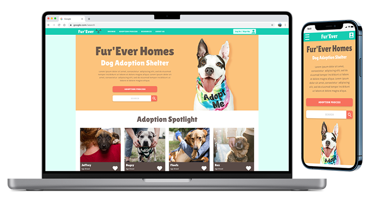
A responsive website for a dog shelter seeking to facilitate the adoption process online.
ROLE: UX Research, UX Design, and Visual Design
RESPONSIBILITIES: This was a solo project, and as such, I was responsible for all elements of the case study. This included user interviews, conducting a competitive analysis, creating personas and user journeys, prototyping, conducting usability studies, and more.
DURATION: 6 Weeks
TOOLS: Adobe XD, Figma, Adobe Illustrator, Google Sheets, Google Docs
Design Process
To create a user focused application...
The Design Thinking process to empathize with our users and iterate designs until their needs were met.
Empathize
- User Interviews
- Pain Points
- Competitive Analysis
Define
- Problem Statement
- Empathy Maps
- Personas
- User Journey
Ideate
- Brainstorming
- Userflows
- Information Architecture
Prototype
- Lo-Fi Mockups
- Lo-Fi Wireframes
- Hi-Fi Wireframes
- Prototyping
Test
- Usability Studies
Empathize Phase
Research & Interview Insights
User Research
Initially. in person interviews were conducted with both current dog owners who had aspirations to adopt another dog, and first timers who had never owned a dog before.
However, after the first round of interviews, it seemed that the current dog owners had a lot more experience in ways dog ownership could go wrong, so additional interviews with current and past dog owner’s were conducted, regardless of whether they were interested in adopting or not.
While not directly linked to the adoption process, this additional information proved invaluable.
Pain Points
Perfect Match
Some users had concerns that if they adopted a dog online, they wouldn’t be able to get a feel for the dog’s personality.
Am I Ready?
A common pain point came in the form of concern regarding whether or the user could afford a dog, especially among first time dog owners who had little experience in this area.
Paperwork
Many users were excited about adopting a dog, but many had no experience with the adoption process, leading users to be nervous about what paperwork might be involved and filling it out correctly.
Medical
Primarily amongst current and past dog owners, there was a concern about the dog’s health, and whether or not new dog owners were equipped with all the knowledge needed to keep a dog healthy.
Competitive Analysis
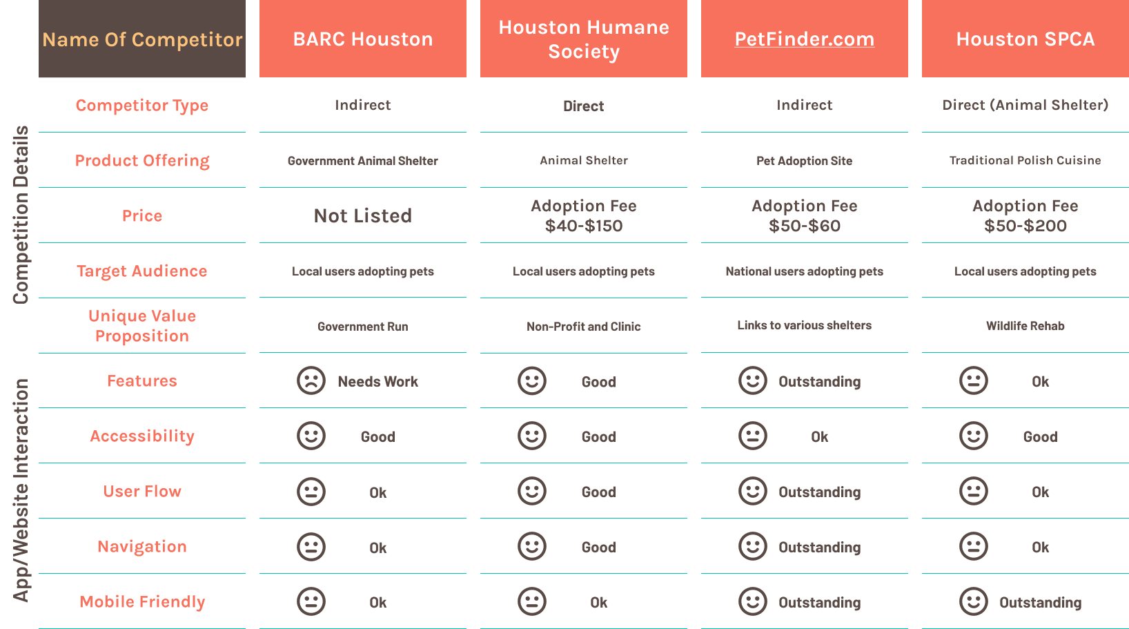
An analysis of several local competitors comparing details and features.
To create a Competitive Analysis, I researched 2 direct competitors (Houston area non-profit shelters), and 2 indirect competitors (a nationwide adoption website, and a Houston-based government run shelter).
Define Phase
Situation & Goals
Problem Statement
Adopting a dog can be a big undertaking, and can require a lot of planning. If the dog is not a good match for the family, or the family is not equipped with the information needed to properly take care of a dog, the dog could end up right back at the shelter.
Proposed Solution
Creating a product that facilitates the adoption process and ensures that the dog is the right fit for the family adopting them, as well as making sure that the family is equipped with all the information they need to take care of the dog after adoption.
Personas
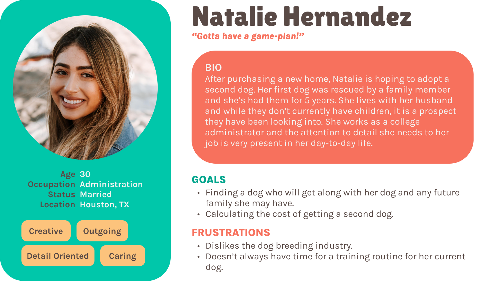
Let's Meet Our Users!
User Journey
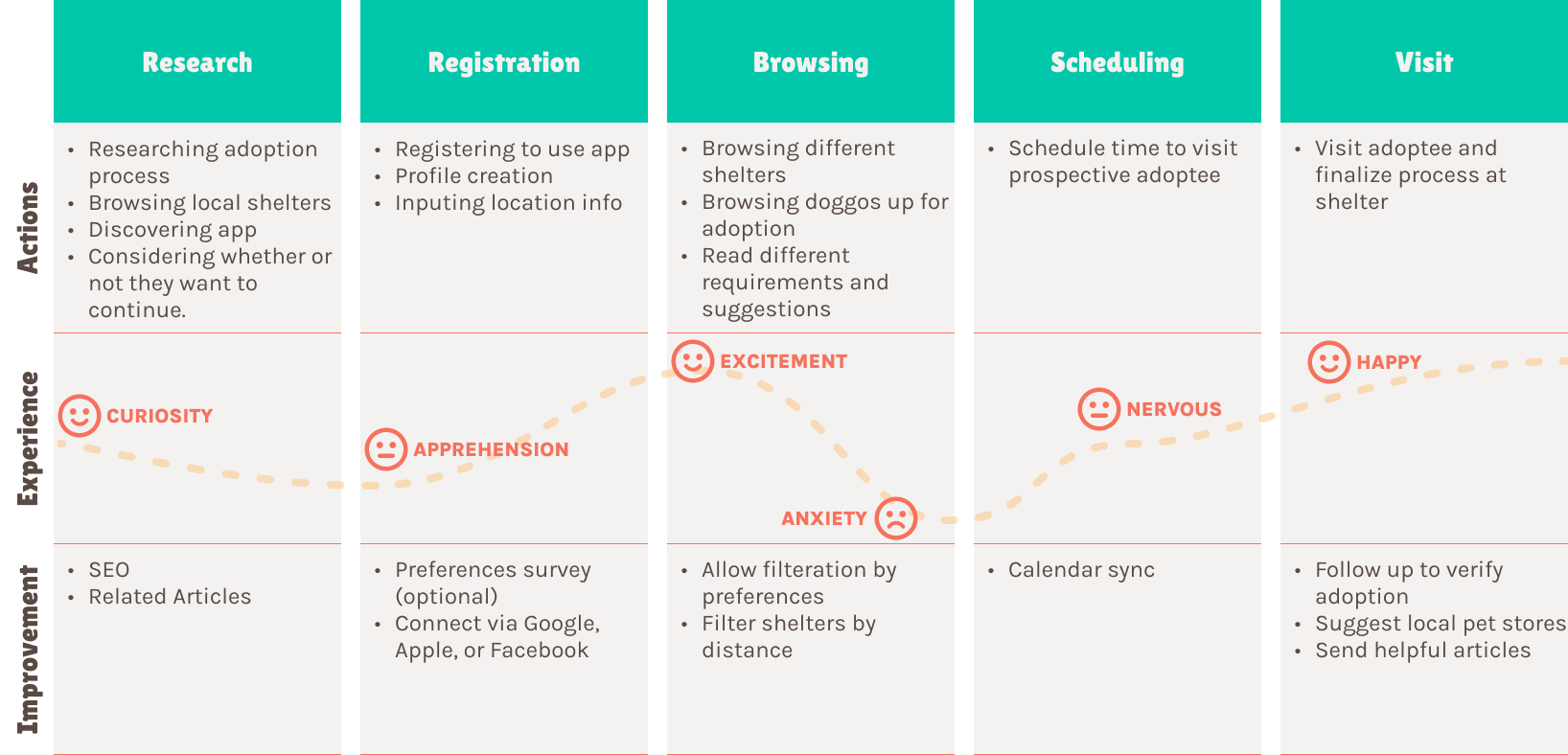
The Emotional Roller Coaster!
Ideate Phase
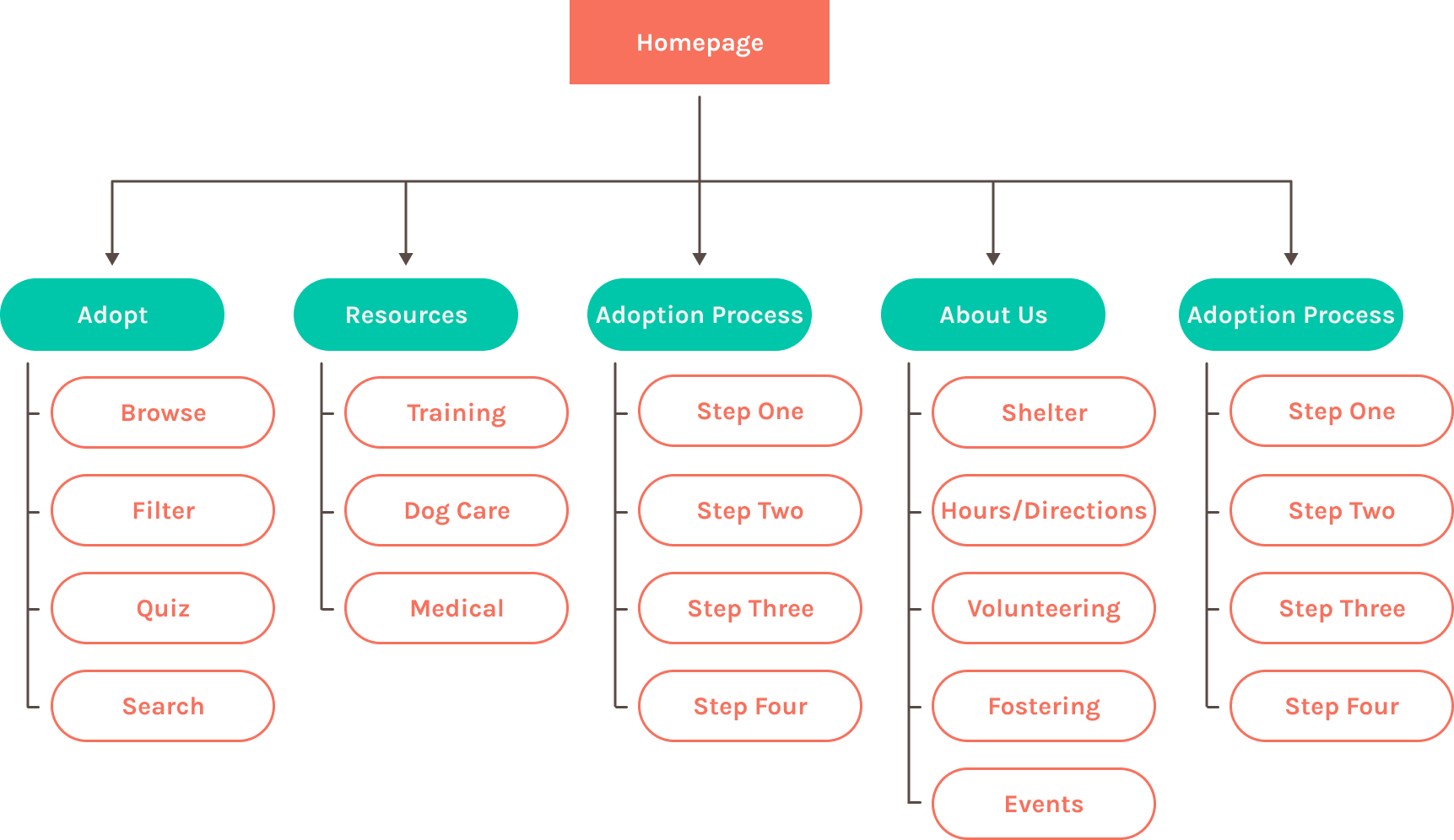
Information Architecture
What do we need?
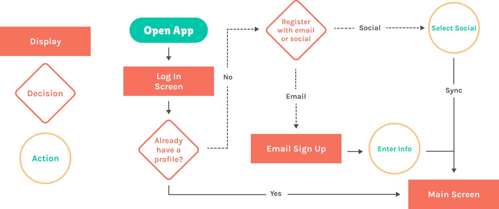
User Flow
How are we getting there?
Prototype & Design Phase
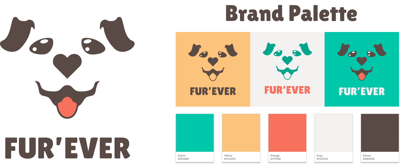
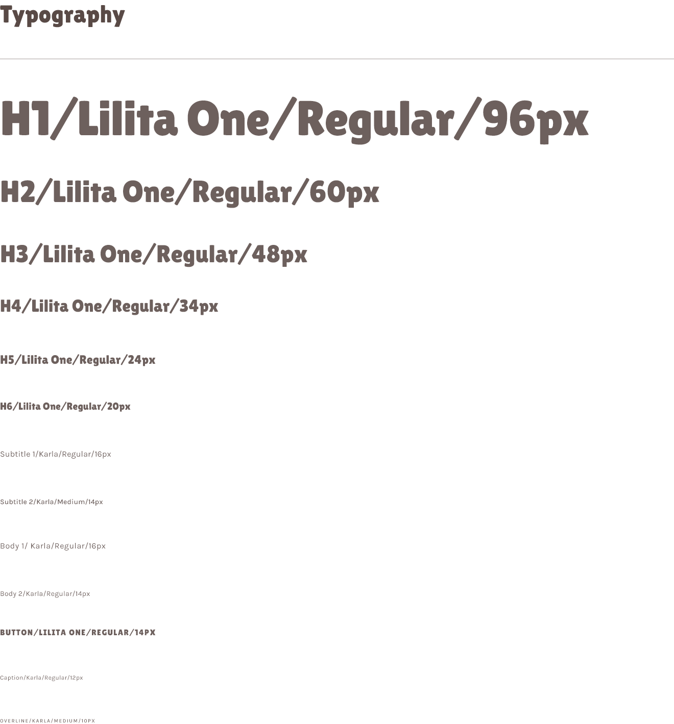
Branding & Typography
Lo-Fi Prototype
Rough Outlines Of Screen Layouts
The image below shows the screens of the online ordering user flow in the Lo-Fi Prototype created for this case study. To demo the full protoype, click the link below.
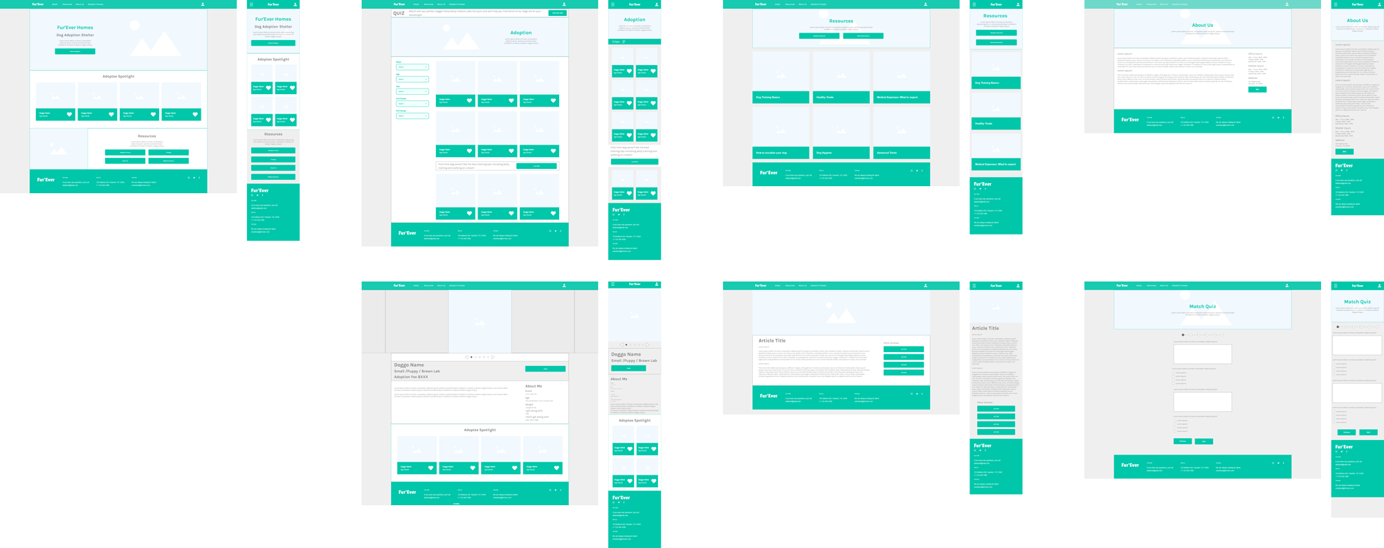
Before moving onto the High Fidelity protype, a usability study was conducted to see what improvements or changes needed to be made. To skip to the usability study, please click the button below.
Hi-Fi Prototype
A polished preview
Below you can see a couple examples of the High-Fidelity Prototype that was created after insights from the first usability were synthethized.

Test Phase
Usability Study
Results From Lo-Fi Usability Study
Research Questions
The compatibility quiz allows users to find a dog that is a good fit for them faster. It also improves the chances of the adoption’s success. Is the quiz location on the site easily accessible and how likely is it to be the first step a user takes.
Are the features included helpful?
What additional features could be added?
Most competitors are having the adopting users call to complete the process. Fur’Ever Homes is using a scheduling system to arrange a visit with the potential adoptee. Does the scheduling system make sense?
Are users confident that the visit will go well?
Is the user likely to use the site again?
Participants
2 participants who don't have dogs
2 dog owners.
1 particpant who has fostered dogs.
Methodology
Users were asked to perform tasks in a low-fidelity prototype
15 Minutes
United Sates, Remote
5 Moderated Usability Studies
Identifying Themes
Critiques for your consideration
Once the usability studies had been conducted, the notes from each study were transferred to post it notes and organized into categories. Though these categories themselves do not constitute themes, themes can be gleamed from them. For instance, the categories of 'confused with adopt CTA', 'clarification regarding process', and 'didn't know what to do next' categories together indicate a theme. That theme could be called, 'adoption process'

Insights
But what does it mean?!
Once themes have been identified, they need to be turned into insights. In the previous example, we found the theme 'adoption process'. What does that mean? Since many of the participants needed clarification on the adoption process, it can be infered that the current layout may lead to customers calling the shelter instead of using the built in system. Working off of this insight, we can rework the user flow to be more intuitive.

Takeaways
Based on the feedback from the usability studies, one of the main issues was confusion with the adoption process. Part of the solution was to add an adoption process tab in the header leading to a page that outlined the steps for the adoption process. We also included additional prompts to clarify the process with the users as they progress through the steps.
Next Steps
Another round of usability studies focused on the participant's ability to complete the adoption and visit scheduling process.
Various other suggestions were made including fostering information and events. These items have been added to the about us section but it is unclear if this is the best location for these items.
Once another round of testing has been completed, if the majority of issues have been resolved, a report will be sent to development, while the UX team begins a new design sprint based on new suggestions.